You will need the following assets in order to complete this tutorial. Please download them before you begin. If they are not available, you will need to find alternatives.
- Astronaut stocks (Multiple)
- Sci-Fi Tech brush pack
- Star Texture
- Nebula Texture
- Planet texture
- Sparks texture
- Reflection texture
1. Sketch Base
Step 1
Create a new document by going to File > New. The document can be any size you prefer. I typically use A4 at 300 DPI just in case I want to print it later. For this piece, I'm going to make it a portrait piece to put more focus on a single character.

Step 2
Start the primary sketch by creating a new layer (Command/Ctrl + Shift + N) on top of the background layer, this layer will act as the skeletal form layer, you can rename itForms.


You can start out by drawing a simple skeleton form in any bright colors you prefer. The bright colors are to help make the form standout when you are drawing over it in the later steps. Explore different poses and ideas while you can at this stage, do not limit your imagination, just go wild, and you might even get unexpected results during this stage.

Sketch out the mass of the character to indicate the thickness of it. In this case, astronauts wear thicker suits so the mass should be thicker and more bold, but also make sure to check the anatomy and proportion of the character.

Step 3
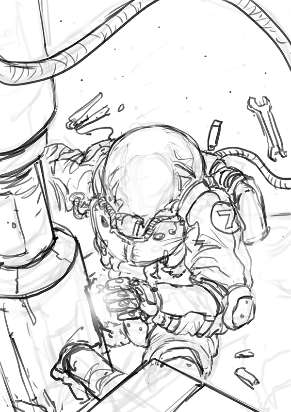
Once you've got the forms nailed down, you can start sketching out the character with rough lines, the lines are not necessarily defined but you must at least be able to be read them by yourself. At this stage you can still explore as much as you can. Start sketching the lines by creating a new layer (Command/Ctrl + Shift + N) on top of theForms Layer, and name it Lines.


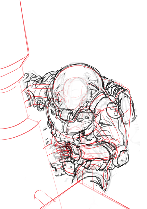
Start sketching out the foreground element and plan your background, you can use various objects as the foreground, from a part of a space station, a space shuttle's hatch or even a giant solar panel, anything you think that fits into the Sci-Fi world you're creating.
2. Bringing in the Values
Step 1
Select your Lines layer under your sketch, and set its blending mode to Multiply as shown in the image.

Create a new layer (Ctrl + Shift + N) on top of the Lines Layer, and name it Values, fill it with a Mid Tone Gray. It can be any gray but just make sure its a neutral, that way you can either darken it or brighten it in the later stages.
To fill the color, simply use the shortcut Alt + Backspace with the color you have picked.


Step 2
On the Values Layer, pick a default round brush or soft brush and set the brush's blending mode to Overlay (as shown in the image). A darker color will automatically darken the area whereas a brighter color will brighten the area, this mode is best for quickly laying in values at this stage.

Now pick any gray darker than your background color and begin to block out the silhouette of the objects.

This step is to separate the main character and foreground from the background, so you can paint them individually later. Now choose a lighter color and roughly put in some values on the background planet, the brighter the color you use the more effective it'll be.

Step 3
At this stage you will have separated the image into 3 parts. The darker area (1) will be your main object. The mid tone area (2) will be the space. The brighter area (3) will be the planet.

Now using the same technique from the previous step, start putting values into the painting. Again, make sure that your brush's blending mode is set to Overlay, you can start on (1) first. Choose a brighter color and start blocking out some basic lighting on the space station panel (From this point on, I will refer to it as Panels). Here are some examples to get an idea of how light works:

Lights are soft, and they disperse through distance. Imagine them as water, when you splash a glass of water onto a object, how and where the water touches the object is exactly how lights touches the object, there will also be minor splashes when the water hits the ground and bounces onto it, lights also works that way. The best way to render your focus point in the painting is to give the subject a primary and a secondary light source, adding a secondary light source will greatly increase the focus and makes it more dramatic.

With the layer Values selected, set the brush's blending mode to Overlay. Now pick a bright gray and start painting out the highlights of the panels, the Overlay blending mode enables you to keep brightening out the area you are painting until it reaches the brightest value (White), the same goes for darkening.

After roughly putting in the values on the panels, start putting in the values on the astronaut as well.

In some brighter areas, a soft brush would also be best in creating soft lighting. With the same settings, just lightly brush over the area you want to lighten up.

Proceed to do the same with the planet behind, you can also easily paint stars by placing a dot with the hard edge brush, and then lightly brushing over it with a soft brush.

3. Making the Planet
Step 1
Create a new layer (Command/Ctrl + Shift + N) on top of the other layers and name itSpace, you can also turn off the other layers by clicking on the eye icon on the left of the layer's name. Now fill (Alt + Backspace) the Space layer with a dark blue, any darker blue will do.


Now using the soft brush, and the blending mode set to Normal, pick a middle tone blue using the color picker.

Now brush around the place where the planet is as the base color of the planet. As shown below:
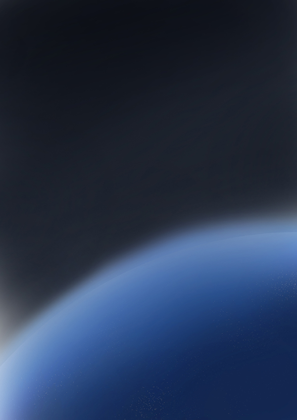
The next step will be overlaying a planet texture on top of this base, but make sure the texture's resolution is high enough as we're going to use just a quarter of it.


Select the Elliptical Marquee Tool (M), hover the cursor onto the center of the sphere, hold down Left Click+Alt+Shift and drag your mouse across the canvas until the selection fits the sphere perfectly as shown below.


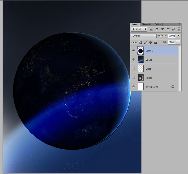

Resize and rotate the texture by using the transform tool (Command/Ctrl + T), simply rotate the highlights onto the right direction and enlarge the texture to make sure it matches the base, remember to hold down Shift while resizing so it doesn't get distorted, press Enter when its in place.

After you have placed it in the right position, open up the Brightness/Contrast panel (Image-Adjustments-Brightness/Contrast) to raise up both the brightness and contrast. The reason for this step is to avoid the texture from darkening the base too much.


Next, we need to extract the city lights from the texture and lay it on the planet. Open the texture in another window, select the Lasso Tool (L) and make a selection of the lights on the texture as shown below.

Copy and Cut (Command/Ctrl + C and Command/Ctrl + X) the selection and Paste (Command/Ctrl + V) on top of the texture layer of the painting, use the transform tool to get it to match the contour of the planet behind, remember to hold down the Shift key while resizing it.

Next, set the layer's blending mode to Linear Dodge, this mode detects the layer's highlights and uses them to brighten up whatever is behind it. The black area will be visible since it doesn't have any lighter value to brighten anything behind it.

Step 2
Next is adding stars to the space behind the planet, stars textures can be easily found on the net, basically any of them will do the job.

Place the star texture onto the painting, set the blending mode to Linear Dodge again.

You can also extend the textures to put on the planet as well. Next, lets add in some nebula textures to give the space more colors, making it more lively and interesting.
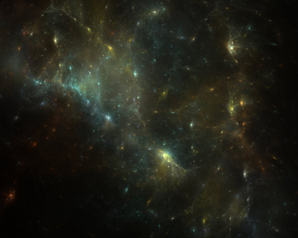


And you're basically done. You can still make modifications by adding different textures over it. You can also merge all of them into one single layer to reduce the file size.
Press Command/Ctrl + Click to select the multiple layers you want to merge, right click and select Merge Layers, or just press Command/Ctrl + E.

4. The Astronaut
Step 1
Painting the astronaut and the panels. Move the Values layer on top of the planet background you have just created. Use the Lasso (L) or Eraser (E) tool to remove the background on the Values layer.


Step 2
Start blocking in rough colors to set the direction, with the Values layer selected, open up the Hue/Saturation (Command/Ctrl + U) panel, tick the Colorize box and move the slider until you get a brownish/yellow hue, as that's the standard suit color of an astronaut.

Next, lock the transparency of the layer by clicking the little checker icon next to the word Lock, after it is enabled, a pad lock icon will appear on the layer.

Here's a quick explanation on how Lock Transparency works:

Since the background of the Values layer was removed, it is now empty is Transparent(A), meaning you can see whatever that is behind this layer. As for the Solid (B) area, it blocks out whatever that is behind it since it's filled. Enabling Lock Transparencyenables you to paint within (B) and will never go over (A). This is especially useful when you need clean edges to separate foreground from background elements.
Now select the Lasso Tool (L) and mask out the panels, with the panels selected, use a soft brush block in the rough colors.

With the transparency locked, put in some colors and values for the character, as well. There are no specific brushes to use for this, a mix of the hard and soft edge brush will do most of the job. You can also use the same technique of setting the brush's blending mode to Overlay.


Just continue refining the forms of the character and slotting in the details.


Don't be afraid to explore and don't feel limited by the existing line art, also start to think about the design and the color choices, extensive research will definitely help to enhance the painting. The best way to understand more is to do studies on real astronaut suits, understand how and why they are made that way, then incorporate the knowledge into the painting.

5. Using Photos
Step 1
Using photo textures is the most efficient way to add details to a painting in a short amount of time, this is especially useful while working in the production pipeline. However, try not to use too many photos as it will become a habit and make you a lazy artist. Make sure that you already have a strong art foundation and technical skills before jumping into this step as it may lead your learning curve into the wrong direction. So explore this technique with the right mindset and you will definitely learn something from it.
Let's start with the head of the astronaut, here's a photo of an astronaut from the NASA Gallery, the helmet and the light is close to what the final image is suppose to look like.

Using the Lasso Tool (L), cut out the area that you want to use and paste it onto the painting.


Erase the edges with a soft brush, and paint over it with your desired design and make sure it fits with the rest of the painting.


Step 2
Next is to add in some secondary colors onto the character, using a hard edge brush, set the brush's blending mode to Overlay and pick a bright orange color.

Paint over the areas that you want to apply the colors on.

Now you can use the same technique and use photo textures to support some of the details on the suit. You can take random bits from the photos you choose. For instance, you can even use parts of the space station on the suit.


Remember to do some paint overs to make sure it fits the painting, and make sure the lighting matches the painting as well. Continue to add in details on the suit, things like wires/reflections/tubes/equipments etc. Next, add some reflections on the helmet to make it more shiny and reflective, a Christmas ball would make a great texture, the shiny surfaces almost works like a mirror.

Place it onto the painting, used the Magic Wand (W), and click on the white corners of the texture, press delete to remove it. Then set the layer's blending mode to Linear Dodge.


Open up the Brightness/Contrast panel, make reflection darker with a higher contrast. To make sure that the texture is not overly bright and takes the painted details away.

Now resize it using the Transform Tool (Command/Ctrl + T) and move it to position of the helmet.

Next, open up Hue/Saturation (Command/Ctrl + U) and change the color to blue by moving the slider to the right, desaturate the color of the texture as well by moving the slider to the left.

Erase the unwanted parts with a soft brush and you are basically done.

The next step would be adding in sparks, to depict the scene that the astronaut is repairing the panels. Cgtextures.com provides tons of great stock photos to choose from, plus they are absolutely free to use.

Place the texture on-top of all of the layers, move it to the area round his hand and set the layer's blending mode to Linear Dodge.


Erase some parts of the sparks and feel free to paint a few more sparks of your own onto the same layer. Repeat the same steps on painting the panels, but keep in mind that the panels are not the focus point so be sure to not spend too much time on putting in details, even just rough strokes of colors and value will finish the job.


6. Lighting it Up
Step 1
This stage will be all about lighting the painting up, there are various ways to apply final lighting touches, blending modes like Linear Dodge, Color Dodge, Hard Light, Screen and Overlay are most useful at this stage, so do not be afraid to explore different blending modes to learn how they work.
Create a new layer (Command/Ctrl + Shift + N) on top of all the other layers, set the blending mode to Linear Dodge. Make sure that the brush's blending mode is also set to Linear Dodge, this allows you to repeatably brightening up the painted areas. Let's start on the helmet's lighting, it's going to be a blue cold light so first pick a middle tone blue, make sure its not too saturated otherwise it'll look too artificial.


Step 2
Time to add some lighting on the panels and add floating sparks onto the painting, no specifics in this as well, just have fun and go around placing the sparks. Create another layer (Command/Ctrl + Shift + N), with the blending set to Linear Dodge as well, and name it Sparks. Pick a bright orange from the color picker.

Using a hard edge brush, paint in short strokes of orange, be sure to paint a few more times on top of it to stack up the value and make it brighter.

Create another layer (Command/Ctrl + Shift + N), with the blending set to Color Dodge and name it Sparks Glow. The Color Dodge works almost like Linear Dodge, except that it'll keep most of the darker areas intact and give a more saturated glow. So mixing Color Dodge and Linear Dodge together can give some interesting and yet believable glow to them.


Next, use a soft brush and lightly brush it over the sparks, you will have a subtle glow like the one below:


Step 3
The final elements to be added into the painting are the futuristic user interface used by the astronaut, this is fairly simple and fun to do. You can download all sorts of brush packs from the web, or you can make one from scratch as well. Z-design's tech brushesare one of the most popular Sci-Fi brushes out there.

Make anything you prefer either by using the brushes or by drawing it yourself, explore with different other tools like Lasso, Types, all shapes and sizes to make it more interesting. Here are some samples:

After you get the design you are satisfied with, place in on to the painting and make sure it is on top of all the other layers, then set the layer's blending mode to Linear Dodge.

Since the interface is supposed to be read by the astronaut instead of the viewers, you will have to flip the image. To do so, simply open up the transform tool (Command/Ctrl + T), right click and select Flip Horizontal.

Now use the Transform Tool (Command/Ctrl + T) again, right click and select Distort.

Move the four corners to the shape highlighted like the image below by clicking the points and drag it to match the perspective.

Since the user interface is a bright element, therefore it will be reflected on the helmet as well. Duplicate another copy of the user interface by right clicking on the layer and select Duplicate Layer or (Command/Ctrl + J).

Open up the Transform Tool (Command/Ctrl + T), right click and select Warp.

Warp the texture according to the contour of the helmet by clicking and drag the different points as shown in the image.


Use the soft brush to soften some areas to make sure it's not that obvious and you are done.

Using the same technique, you can also make a similar interface in the background.

7. Lens Blur
Step 1
As the painting is coming to an end, lets add some quick finishing touches to give it a little more depth. By adding foreground elements, it helps to enhance the focus point and adds more depth of field into the scene.
First, select canvas by pressing (Command/Ctrl + A), and (Command/Ctrl + Shift + C) to copy merged, this enables you to copy all the layers you have selected and merge it into a single image in your clipboard.

Next, paste in place (Command/Ctrl + Shift + V), this will automatically create a new layer with the merged image, remember to keep this layer on top of all the other layers.
Step 2
Now apply the Lens Blur by going to (Filter-Blur-Lens Blur), just give a slight blur with the Radius of around 15-20.


Use a soft brush, set the brush size to around 300 pixels and start erasing the supposed focus point, by erasing the blurred layer will expose the sharper imagebehind.

This is most useful to enhance the focus points by blurring the other elements, but be sure to avoid overdoing it otherwise it will go the opposite way and loses the focus point instead.

8. The Finishing Touches
Step 1
There are some Photoshop filters that are extremely useful in adding final touches to the painting. One of these filters is the Lens Correction filter (Command/Ctrl + Shift + R).
Using the same techniques from the previous step, select canvas (Command/Ctrl + A) and copy merged (Command/Ctrl + Shift + C), now paste in place (Command/Ctrl + Shift + V) and make sure its on top of all the other layers. After this, open up the Lens Correction panel (Command/Ctrl + Shift + R)

Do some exploration by experimenting with all the sliders, you could get some unexpected results.
- Geometric Distortion: Warps the image to apply distortions like those in particular camera lenses, e.g fish eye lens.
- Chromatic Aberration: Adds an offset color fringe that can be seen in photos, this helps to add some realistic touches to the image.
- Vignette: Can brighten or darken the corners of the image, also helps in balancing the overall values.
- Transform: Distorts the painting with extreme perspective to add in a more dramatic touch depending on the theme.

Step 2
Adding another layer of noise will be the final touch for the painting. Create a new layer(Command/Ctrl + Shift + N) on top and fill it with a middle tone gray.

Next, go to Filter-Noise-Add Noise.

And slide the noise amount to 400%.

Blur the noise layer by going to Filter-Blur-Blur.

Now set the layer's blending mode to Overlay and slide the opacity to around 5-10% to make it less obvious, you do not need it to be that sharp, just a subtle layer of noise is more than enough.


Conclusion
In this tutorial, we showed you how to paint a sci-fi scene by using textures as supporting assets. Along the way, we demonstrated some useful skills that you can use in your workflow. We hope you learned something from this tutorial and are excited to see what you can come up with on your own.


No comments:
Post a Comment